
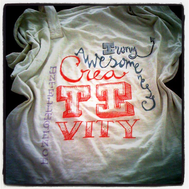
Whenever I make tshirts (or have an idea for a tshirt) I usually go for simple, clean cut, to the point designs. *Insert HUUUGE liar pinocchio nose*
No, but really 🙂 Although I *usually* go for refined, I have the tendency to appreciate the beauty of eclectic sometimes. The shirt above is no exception. I absolutely love typography, even more when the words are the perfect description! So why settle for one?:)
The key for mixing it up, though, is somehow try to keep a common ground, like letters, or only metallic, or objects that relate to a similar category. They *have* to meet somewhere! So that the whole design doesn’t end up looking like a mess.
I love the cut and the texture of this particular one here, the lettering only made it more awesome, i think ![]()
xxx
