
I digitally mastered some of the sketches I made for the t-shirt order in the previous post, and I thought you might enjoy them!
Here you go 🙂


I digitally mastered some of the sketches I made for the t-shirt order in the previous post, and I thought you might enjoy them!
Here you go 🙂

As you already haven’t noticed, I have a thing for owls. It’s not *that* obvious, is it?
🙂
Well, I said earlier that I want to create a line *only* for “owsome”ness , as I tend to make more and more combinations of colors and style with the cute little letter O, turning into a baby owl. We’ll see.
Meanwhile, you enjoy these ones, and make sure you drop me a message if you want your own owlsome.
This one is in black-white filter:

Cheers, everyone!
Make sure you enjoy the last bits of your weekend! xx

Some of you may find it rude, (if you are above 60 :p) But I like the life style behind this. IT’s basically like, “Let it go, dude.”
So this little metallic and black painted shirt aims just that, Chillax and fuck that shit! with a cute lettering.
Cheers!
xx

So, my best client- my father- asked me to do a design with bold letters and thick colors; preferably with switched letters! With so much restriction, I didn’t have the only thing I needed; The Quote!
But I checked into my portfolio, only to find “stressed – desserts” combo! It would be perfect! I thought, with so many letters available for switching and turning and playing around. 🙂
The message itself is like worthy too, He always has been the laid-back kinda guy.
So here it is, the final work!
Enjoy,
xx
As I have made my promise, earlier today, I am now posting more concert t-shirts I made for clients. They gave me absolutely no idea and/or inspiration tips to help create my design process, but I think they turned out pretty well !
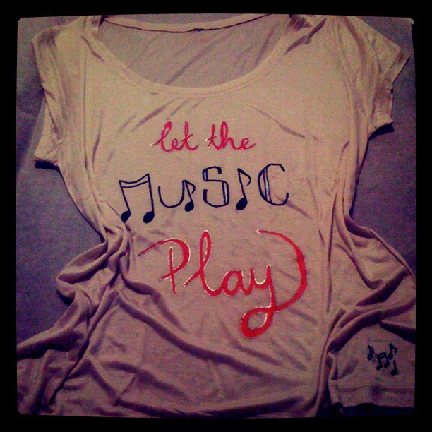
Have you seen the “surprise” notes on the side? I think they are *adorable* 🙂
I wanted something Music theme-y, so I came up with turning the actual word into notes, and always something playful helps, so I added” Play”. Hah, I have NO sense of humor.
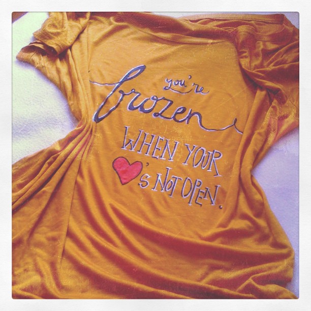
Oh and Frozen. Oooooh Frozen. Boy, do I love that song. I think it’s very meaningful and has a *teaching vibe* even back in the day, when modern day self-helps and positive thinkings were not so much widespread.
The beat is splendid and exquisite as well. I just love that song. And also Ray of Light. And all of that album. Gaaaaaah, I’m ranting:/ I might make myself one and wear it as I phone-listen to friends shaking it at the actual event. 😦

I’ll keep you posted for even more concert t-shirts and more!
xx
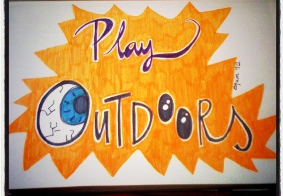
Probably one of the things I feel sad about kids today is, that they don’t get to enjoy outdoors any more. I mean, even if they *tried* to enjoy, there aren’t enough spaces like grass and play grounds. Not in cosmopolite cities anyway.
I’m not saying that computers and video games are *totally* bad ( heck, I even learned English playing video games!) but they absolutely don’t compare to outdoor activities.
A child’s mood, inner peace and connection with other beings in the world are directly related with spending time in the nature, interacting with animals and plants. At least I firmly believe so. And when I have a kid, I will make sure she/he spends plenty of time playing outdoors.
I didn’t mean it to be a promotional campaign kinda t-shirt, but I do enjoy the message it is giving!
Here is the shirt version of it, I liked how the colors turned out.

Do yourself a favor, and try to save sometime to walk, have a tea outside, or just play with your pet.
Connect with the world you live in !
xx
-the girl who is capable of drawing extremely philosophic conclusions out of simplest things
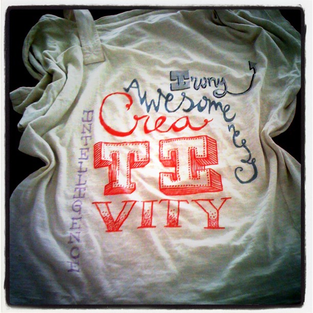
Whenever I make tshirts (or have an idea for a tshirt) I usually go for simple, clean cut, to the point designs. *Insert HUUUGE liar pinocchio nose*
No, but really 🙂 Although I *usually* go for refined, I have the tendency to appreciate the beauty of eclectic sometimes. The shirt above is no exception. I absolutely love typography, even more when the words are the perfect description! So why settle for one?:)
The key for mixing it up, though, is somehow try to keep a common ground, like letters, or only metallic, or objects that relate to a similar category. They *have* to meet somewhere! So that the whole design doesn’t end up looking like a mess.
I love the cut and the texture of this particular one here, the lettering only made it more awesome, i think ![]()
xxx
